top of page

PRINT & DIGITAL MEDIA
Newsletters, flyers, brochures, booklets and web site layouts.
ADVERTISING
Need an ad for your business? I got you covered whether it's small or a page of any size.
DESIGN
Logo and identity creation for your business. I can help make it unique to YOU.
 Barbershop Business Card - FrontLogo and branding design for a local barbershop in Red Lion, PA. Client desired a retro style logo. The design was inspired by 19th Century Victorian Art Nouveau. |  Barbershop Business Card - Back |  Barbershop Prices Sign |
|---|---|---|
 Barbershop Gift Certificate- Front |  Back of Barbershop Gift Certificate |  Salvation BookletA gospel tract that is included in a visitor's packet at my church. |
 Salvation Booklet Interior |  Church Brochure Exterior CoverAlso included in the church visitor's packet. Basic information about the church, pastor and beliefs are stated. |  Church Brochure Interior |
 Campaign Business CardDesign represents the people of Ohio, working class and farmers. The design told voters that Mr. Manchik is one of them, part of the working class and not a politician. |  Back Campaign Business CardThe 10 Key Values of the Green Party are stated for voters. |  Campaign Cover PhotoDesigned to the exact specs for a cover photo on the campaign's official Facebook page. The design from the business card was continued here and throughout the marketing materials. |
 Campaign PostcardDesigned to postal standards to be sent to Ohio residents in the 12th Congressional District. |  Campaign FlyerDesigned for campaign events to be handed out personally to voters. |  Dollar Bill Redesign - FrontThe first part of a series where I redesigned United States currency for fun in a simple, modern style, color scheme and layout. Each bill includes redesigned security features. Some of the former presidents and individuals on real currency were removed for more modern, American figures. |
 Dollar Bill Redesign - BackThe reverse side of each redesigned bill includes an iconic image. An image that the individual on the front of the bill is famous for. In this case, Washington's trip across the Delaware is inserted. |  5 Dollar Bill - FrontPresident Lincoln remains on my version of the five dollar bill. Security features included on this bill (and the rest of the series) are the number value of the bill within the shield of the official seal of the U.S. The numbers are in small type and are infinitely repeated. |  5 Dollar Bill - BackJust like the real bill, the iconic Lincoln Memorial remains. |
 10 Dollar Bill - FrontIn my redesign, Alexander Hamilton was removed and replaced with astronaut Neal Armstrong. Historically known for being the first American man to walk on the moon. |  10 Dollar Bill - BackThe iconic image of Armstrong walking on the moon and the iconic American flag placed on the lunar surface. |  20 Dollar Bill - FrontAndrew Jackson was removed in my redesign for Henry Ford. |
 20 Dollar Bill - BackFor the reverse, the image of the assembly line of the iconic Model-T that was the first automobile that the American middle-class could afford. |  50 Dollar Bill - FrontPresident Grant was removed and replaced with one of the most iconic civil rights figures-Rosa Parks. |  50 Dollar Bill - BackIconic civil rights photo of Parks included on the back, refusing to give up her seat and sit in the segregated part of the bus. |
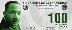 100 Dollar Bill - FrontBen Franklin was removed to honor the most famous and beloved civil leader in American history-Dr. Martin Luther King Jr. |  100 Dollar Bill - BackIncluded on the reverse is the MLK memorial Washington D.C. | 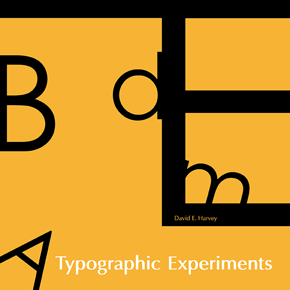 Typographic Experiments BookThis book uses the theme of the human body. Each page depicts an image of an organ made out of type and supplemented with shapes. |
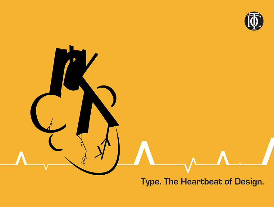
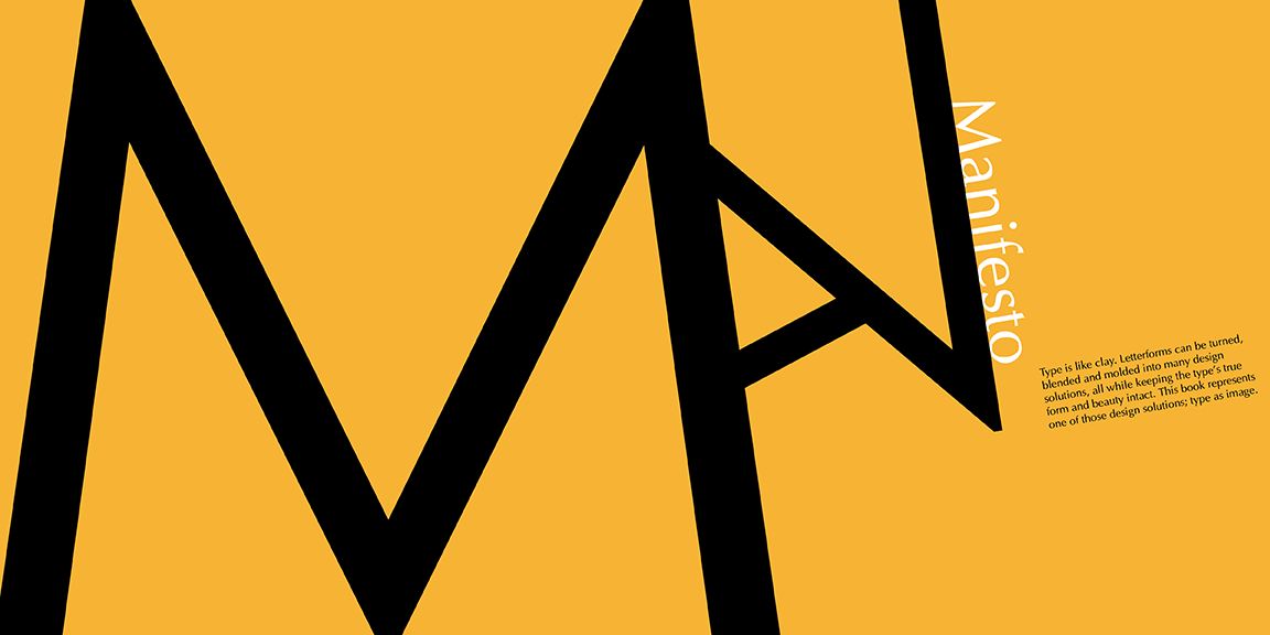 Inside Cover and ManifestoSummarizes the purpose and philosophy of this book. |  Vitruvian Type Man |  Typographic Heartbeat |
 Type On the Brain |  Upset Stomach |  Type Intestines |
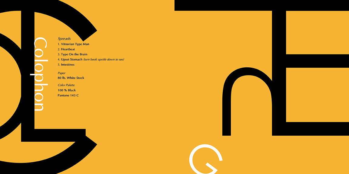 Colophon and Inside Back Cover |  Back Cover | 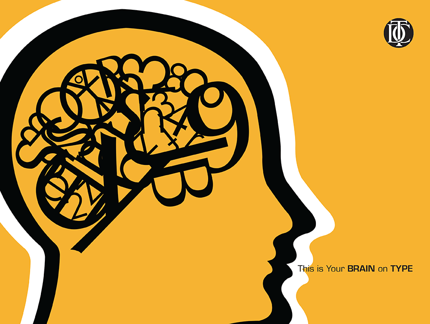 TDC Type Poster 1This poster is one out of three in a set of concept posters that could be sold by the Type Directors Club. Each image was taken out of my type book and set with a creative statement. |
 heart type posterTDC Type Poster 2 | 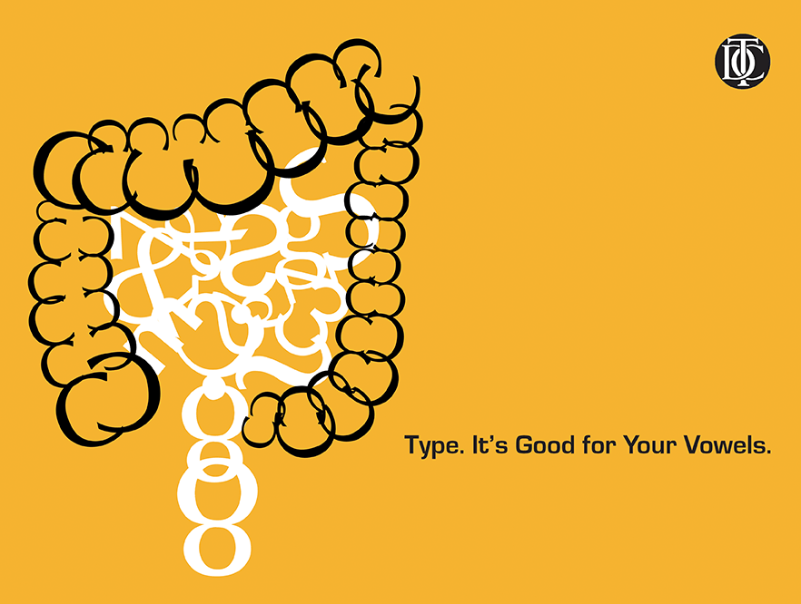 TDC Type Poster 3 |  John Deere Magazine AdA B2B ad that would appear in Garden Center Magazine. By using a racing concept, stores who choose to sell John Deere lawn mowers will be selling a superior product than other brands. The superiority of a Deere will be passed to their customers giving an edge over their neighbors. |
 ThermaChill PackagingA redesign and re-branding of the Dollar Tree brand of pain relief compress. I wanted the design to be simple and eye catching. I created a brand name and chose a color scheme that would convey to the customer that ThermaChill would relieve their pain. |  YWCA Marketing BrochureA mailable, five panel, marketing brochure for the York County YWCA. The focus is on their aquatics program. Photography included therein, are my own and were taken with permission. | 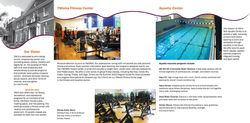 YWCA Marketing Brochure (inside) |
 Feathers & Fur LogoLogo for feathers & fur Pet Pharmacy that is a fictional, stand-alone pet pharmacy. I wanted the logo to be welcoming, friendly and professional. | 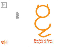 feathers and fur promo mailer frontThis mailer would be sent to residents in the area when one of the pharmacies would be having a grand opening. I wanted the cover to be simple and eye catching. I took the ampersand from the pharmacy logo and included a creative tag line. |  Promo Mailer(back)The inside would give the viewer an invitation to an open house event and a short overview of the pharmacy's services. Quality and trust would be established within the body copy. |
 Pet Pharmacy Home PageLayout features a simple design that would be easy to read, navigate and feel friendly and inviting. I wanted the philosophy/mission statement to meet visitors to the site in order to establish trust immediately before navigating elsewhere. I also included the VIPPS logo that would establish it as an accredited pharmacy. | 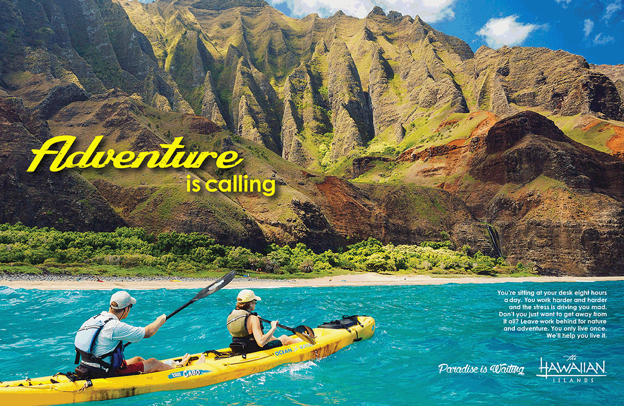 Hawaii Marketing CampaignThis piece is a magazine spread part of an ad campaign for the Hawaii Travel Bureau. This spread would appear in Afar Magazine with a target market of 35-55 highly educated and affluent men and women. A median age of 45 of seasoned travelers and people who never traveled much at all. The theme of the campaign is nature and adventure with a slogan on each piece. The slogan and the focal point are meant to beckon the viewer to take a vacation from work and travel to paradise. | 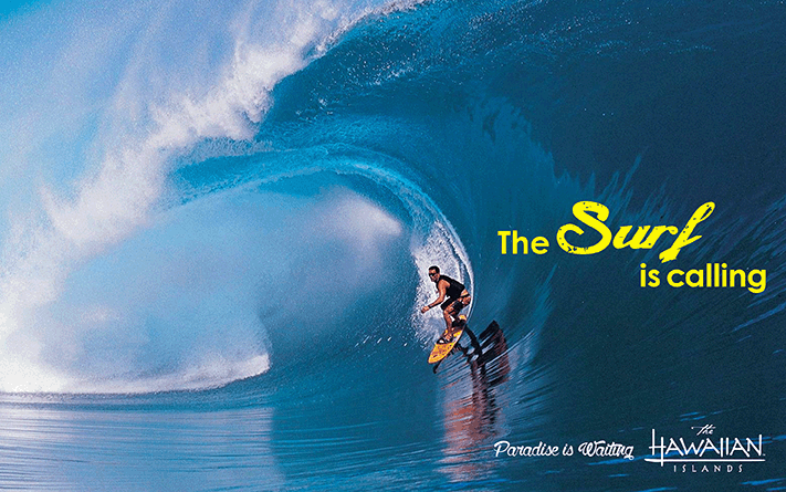 Hawaii Newspaper AdWould be featured in The New York Times in full color. Size being 9 7/8 x 6 3/16. I chose color over black and white because the ad would loose its impact without color. When advertising a destination like Hawaii, a full color ad is a must to drive home the beauty of the surf and adventure of surfing there. |
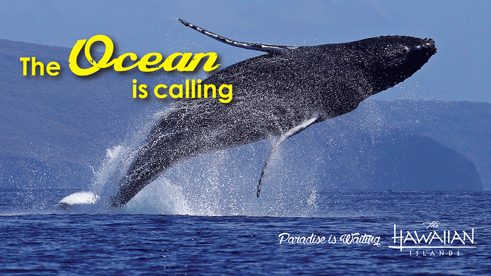 Whale Watching BillboardAdvertising whale watching and ocean activities in Hawaii. Full size would be 10.5 ft x 36 ft and would run in February and May (along with the rest of the campaign). February for people who plan for a spring vacation and May for a summer vacation. | 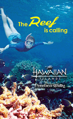 Snorkeling Web Banner AdSize would be 240 x 240 and would be static. | 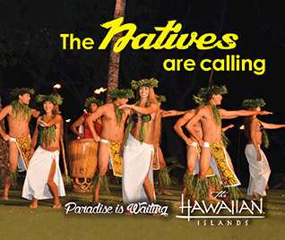 Luau Web Banner AdSize is 300 x 250 and would be a static ad. |
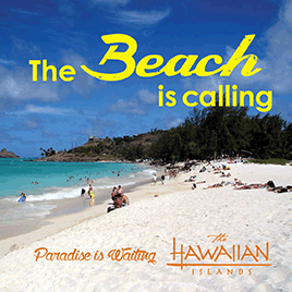 Beach Web Banner AdSize is 250 x 250 and would also be static. |
bottom of page